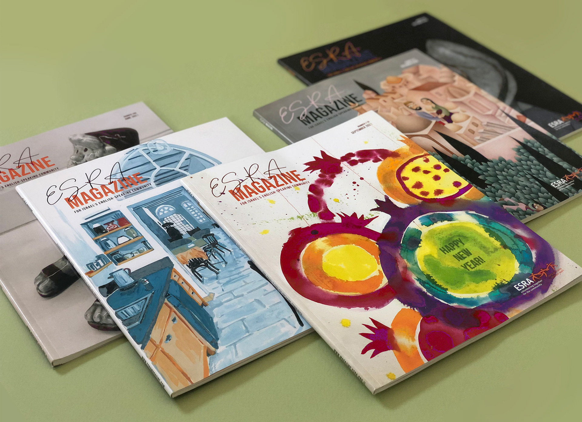
In July 2020, ESRA hired me to redesign their magazine. Faced with the task of rethinking this magazine that is so loved by its readers, my first suggestion was to have beautiful Israeli art on every cover, to connect the different issues in an aesthetic and purposeful way.
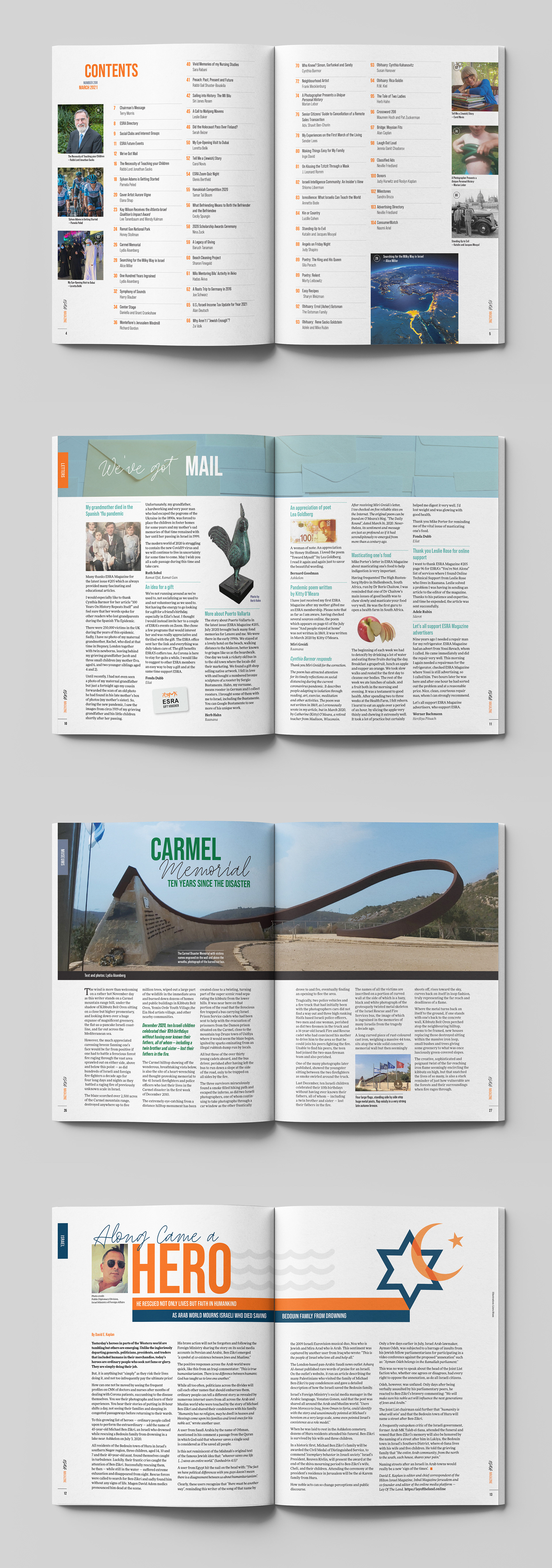
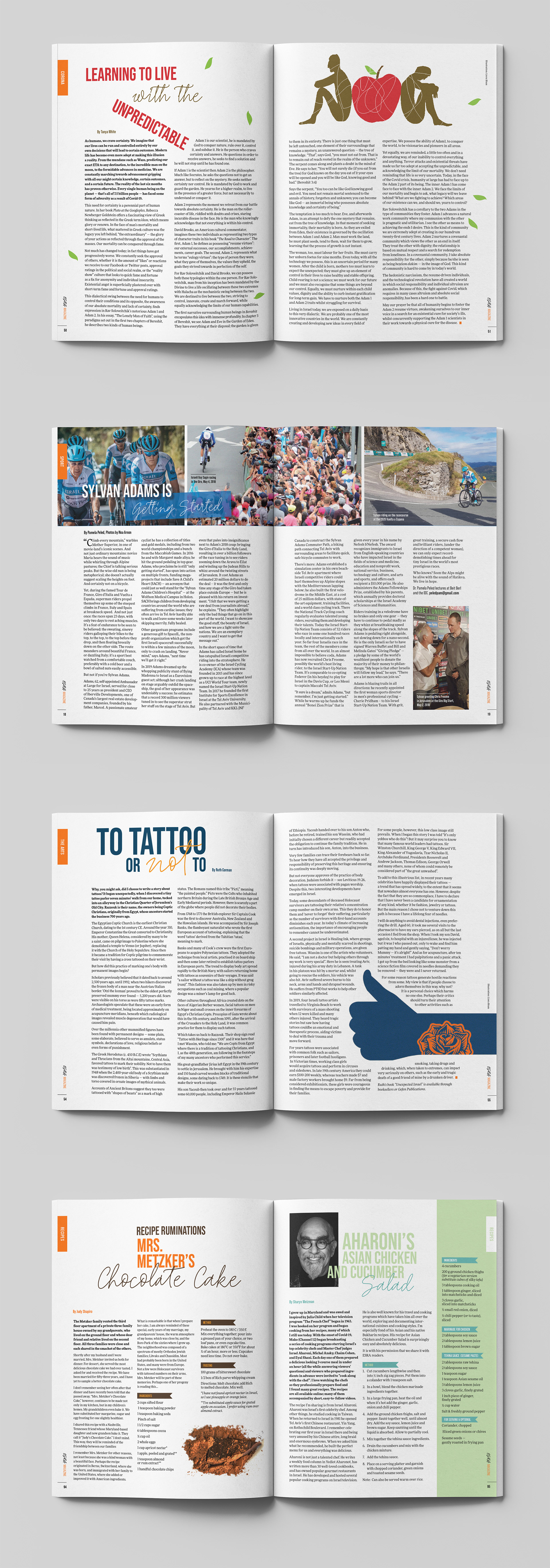
TYPOGRAPHY: Headers include a combination of two fonts – a bold, condensed sans-serif font with a flowing, hand-written one. This symbolizes the nature of the magazine: clean and practical, but with a heartfelt, human touch.
GRID AND LAYOUT: On the inside pages, the magazine name descends vertically down the side to meet the page numbers that emerge from the margins. Callouts are bright and placed inside the body text to draw readers in.
LAYOUT: Images can span double spreads where possible, for maximum visual impact. The success of the spreads relies on a combination of typography, grid and photography.
PHOTOGRAPHY: Images may be cut out to form aesthetic layouts with plenty of white space.
COLOR SCHEME: A bright color palette was put together to create a youthful, vibrant feel.